KC&A CI
Connecting customers and products based on trust Finding new values in changes
and growth KC&A looks beyond convenient and happy chemicals.
Expressing the company’s drive
to become a general trading corporation.
he new CI was developed to reflect the company’s drive to go
from being a trading firm primarily handling chemical products
to becoming a general trading corporation that deals
with a variety of products.
The present and the future of the company, which is growing into
a global enterprise, have been expressed through a logo type
that extends powerfully over straight line images.
Moreover, the green color, symbolizing a clean environment
and an impression of comfort, is used to declare that
our company forms reliable and trustworthy partnerships.
-
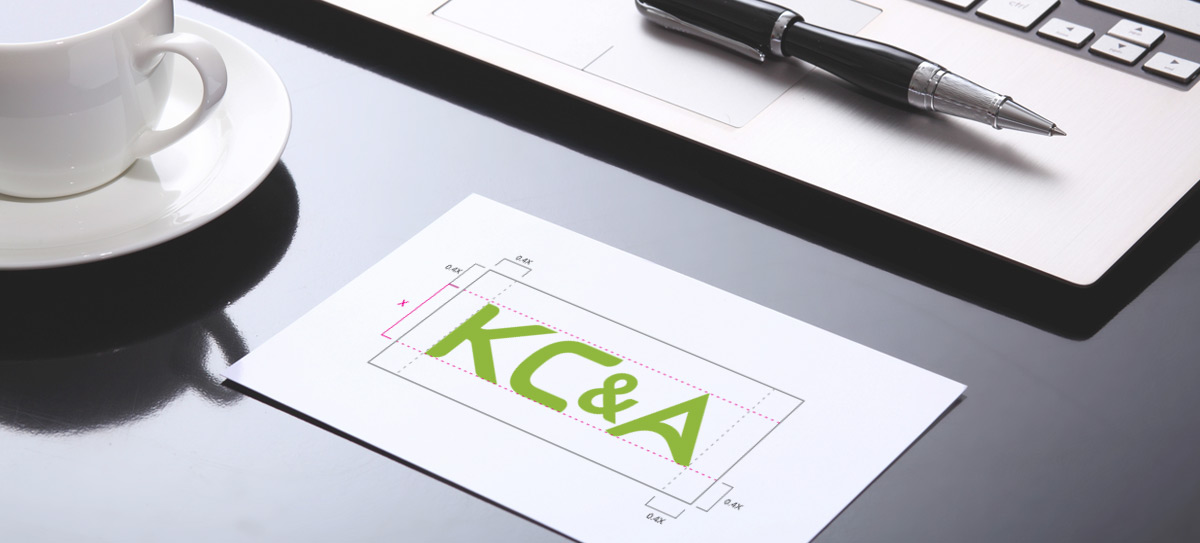
Logo type
The logo type is an essential design element that constitutes the identity of KC&A along with the KC&A logo.
Also, the logo type may be used to express the identity of KC&A in place of the KC&A logo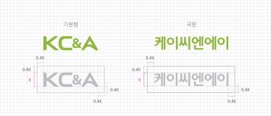
-
Logo type
GrayscaleGrayscale is used in cases where it is difficult to reproduce the colors of the KC&A logo, and must be used with
caution to maintain the original logo form even if it is expressed in a single color.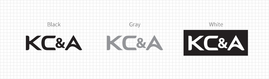
-
Graphic motif
Graphic motif is an essential design element that constitutes the identity of KC&A.
The graphic motif may be applied in basic type and grayscale type (black, white, and gray),
and the use of other colors must be avoided.
Basic type 
Grayscale type -
Exclusive colors
Exclusive colors are an essential element that constitutes the identity of KC&A.
They must be applied without any deformation or distortion in accordance with the proposed criteria.-
KC&A Green
-
Process Color
C50 M10 Y100 K0
-
RGB Color
R143 G183 B62
-
Spot Color
Pantone Color376C
-
Process Color
-
KC&A Green